| |
| Mines Building Design |
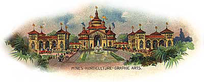 |
Like its companion in the western Esplanade, the Horticulture Building, the Mines Building was designed by the Boston architectural concern, Peabody & Stearns. It was square in design with four square towers at each corner; a skylight in the middle provided interior light. In its 30,000 square feet of exhibition space were displayed samples of minerals,ores, gems, gold, silver, limestone, petroleum, salts, mineral paints, clay, brick, marble, etc. from many states, Ontario, Nicaragua, and Guatemala. (Mining exhibits from other countries were displayed in the building of their respective country.) Also on view were mining equipment and instructional displays of mining methods. The center of the interior was devoted to an exhibit of all the precious stones and gold in the U.S, including gems. Here were a series of photograhs illustrating gold-mining at Cape Nome. Toward the front of the building the windows were filled with large color transparencies of the greating mining sites in the U.S. Companies represented included the Retsof Salt Company of Retsof, New York (salt); Aluminum Lustre Company, Carson City, Nevada (diatomaceous earth); Baden-Powell mine, Rat Portage, Ontario (gold ores); Great Lakes Copper Company, Sudbury, Ontario (copper, nickel ores, pyrrhotite); Piedmont-Cumberland Coal, Piedmont, West Virginia; Standard Oil, New York, New York (oil and its products); Warsaw Blue Stone Company, Warsaw, NY (sandstone and bluestone); there were over one hundred others representing the U.S. alone. The Mines building was linked to the Horticulture Building by the connecting South conservatory which was used as a hothouse for palms, cyads, dracaenas, caladiums, ferns. The Horticulture/Mines/Graphic Arts buildings were the western half of the first series of buildings a visitor encountered after traversing the Triumphal Bridge. Director of Color C. Y. Turner's general plan was to have the color of the buildings reflect their position in the evolutionary journey of civilization. These first buildings, according to Turner, were to be in colors "crude and strong". (The other end of the grounds, culminating in the Electric Tower, represented the refinements and achievements of humankind; their colors were brighter and/or more vivid.) Observers described the roofs of these three buildings as "medium dark terra cotta" and the exterior walls as "orange" or "a warm buff color" with "details of brilliant blue, green, rose, and yellow."
|